


CTexT (Centre for Text Technology)
This was a fun project depicting the nature of the very successful and awarded NWU niche area, which developed the Afrikaans Speltoetser and many more commercial products. In learning more about CTexT and the industry it operates in, it was interesting to note the complex programming, research into human language and reasoning, as well as the technological and linguistic knowlede and experience required to enable human connection through communication.
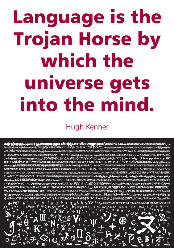
In an attempt to honour this, a lot of the graphics depict very textured, layered masses of text or characters, contrasted with bolder, simpler messages or elements. Text can indicate a bold and clear message that is easy to read and understand, but also serve as a tonal value or shape - while depicting (sometimes coded) more subtle meaning. Language is so incredibly rich, but in the end it all starts with coherent mark-making which developed into the letters of the alphabet as we know it today (much as binary code can represent the basis of computer language - so the vision and mission is used in various codes as graphics).
At times the progression of the written word is depicted through font choice, or the seemingly random arrangement of characters (including rock art, pictographs, hieroglyphics, rebus writing and cuneiform) becomes a known and ordered set of 26 letters, developing into the digital age. The Rosetta Stone served as inspiration for its contribution to translation, and the graphic elements of the different texts together. Where text is used abundantly, it also emulates the textures of the Stone, which on closer inspection, reveals words.
Throughout the designs, various aspects of language are depicted, such as the origins of the alphabet, international quotes about language, local and African greetings, characters as graphics, and CText's vision and mission in different formats.
The "C" in CText also got me wondering what it could stand for besides "Centre", as the association with the (ambiguous) word, "character", seemed auspicious. So I used words starting with "c", then "t", "e" and "x" (not so abundant) from a few dictionaries, which I thought could be a bit fun within the framework of serious-looking text.
So many possibilities exist to translate the inner workings of language, technology and translation tools into visuals, and tapping into the inspiring world of words, visually, was a good challenge.